Read an Excerpt
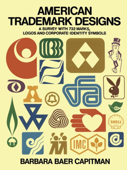
AMERICAN TRADEMARK DESIGNS
A SURVEY WITH 732 MARKS, LOGOS AND CORPORATE-IDENTITY SYMBOLS
By Barbara Baer Capitman Dover Publications, Inc.
Copyright © 1976 Dover Publications, Inc.
All rights reserved.
ISBN: 978-0-486-15745-0
CHAPTER 1
ENTERTAINMENT, LEISURE, SPORTS
(Including Hotels and Restaurants)
The world of entertainment is so varied—in form, in location, in mood—that one can only show a few representative examples. These range from the "underground" humor of Tiffany's Attic (Fig. 81), a Kansas City nightspot, to the classic abstraction of the CBS "eye" (Fig. 18). Sports trademarks, of course, have a life of their own, appearing on the sails of boats, the gut in tennis rackets, the housings of motors, and the shirts of owners! Many of these marks are typically active-looking. Some hotel marks were chosen because of their unrelenting ubiquity; others—Santa Fe's Bishop's Lodge (Fig. 60), for example—for their dignity. And restaurant marks range from the familiar, straightforward Howard Johnson's peaked roof (Fig. 82) to the elegantly abstracted Four Seasons' trees (Fig. 35). This group of marks is quite thematic in approach since the "product" is narrowly defined. We have included many of Saul Bass's early film title marks, which opened up whole new areas, television and film, to graphic designers.
CIVIC INSTITUTIONS AND EDUCATION
There are no venerable trademarks in this section—symbolization of public services and institutions is a relatively new concept. A community college founded as recently as 1964 traded in its "traditional" seal in 1970 for a new mark combining a letter form with a schoolhouse abstraction—an updated, simplified device. The symbol for the International Women's Year (Fig. 92) is endlessly—even dotingly—employed because it is a simple strong design with an effective interplay between two themes: the inner design of the biological symbol and the outer form of the peace dove. Many of the best marks gain their wit and strength from the use of visual-illusion devices, as in Fig. 111, where the child's head is merely part of the mother's silhouette; the observer completes the illustration from his own life experience.
These trademarks are employed to increase public awareness of the work of the institution and for promotional drives for personnel and funds. Employed in advertising, directional signage, direct mail and television, and on bumper stickers, pins and shirts, they must be memorable, unique and suitable for today's life styles.
FINANCE, INSURANCE
Many insurance companies and banks and other financial institutions have participated in American visual mythology with their nineteenth-century marks: Prudential's Rock (Figs. 168–70), Metropolitan Life's "The Light that Never Fails" (Fig. 174), the Equitable figure of Justice (Fig. 222), and so forth. But, increasingly, as customers become more sophisticated about finance and as financial firms, competing for business, strive to express efficiency, technological expertise and the power to protect investments and interests, designers have been called upon to abbreviate nomenclature and strengthen and simplify trademarks. This has become one of the strongest areas for new design. Financial institutions are likely to be retail institutions and their graphics must be applicable to signage, whether chastely carved in bronze or looming in illuminated plastic over suburban shopping plazas. Financial marks must also lend themselves to advertising in all media.
FOODS AND BEVERAGES
The enormous franchise and marketing problems involved in altering an old brandmark in this area lead to great care being taken before a mark is changed. This is particularly true when the symbol is a trade figure, like one-eyed Mr. Boh (Fig. 235), who was seen by generations of beer drinkers as a lovable character, capable of making human errors. Such subjective projections attach to the Underwood devil (Figs. 246–47), the Jolly Green Giant (Figs. 278–80), the Campbell kids (Fig. 288), the Morton Salt girl (Figs. 323–24), Borden's Elsie (Fig. 277) and many others. Such was—and is—the power of the trade figure to evoke positive associations for the company, that Quaker, now a giant conglomerate, decided to update, rather than retire, its kindly Quakers Oats figure (Figs. 254–56). But even nonrepresentational trademarks associated with older brands must also be changed cautiously in order to protect franchises, as the sequence of Pepsi-Cola illustrations shows (Figs. 299–305).
Small details often impress themselves strongly upon consumer consciousness. Thus, the pineapple-crown-shaped accent over the o in Dole (Fig. 287) becomes an important marketing device for the manufacturer. The many shields, crests and heraldic designs used in beverage and food trademarks are, of course, meant to imply quality and reliability. The cartouches used by Del Monte (Fig. 289) and Beatrice Foods (Fig. 259) derive from historic architecture, and are also used primarily for their quality associations. However, these design elements also offer a natural and convenient way of setting the corporate trademark apart when used in packaging or advertising.
FURNITURE, APPLIANCES, APPAREL, TEXTILES
Some of the most fascinating stories of trademark history may be found in this group. As in the previous section, many of these marks are trade figures: Buster Brown (Fig. 381), created by a shoe manufacturer and distributor who built a business around this comic-strip cult; the Springmaid girl (Figs. 354–55); the West Point Pepperell griffin (Fig. 348). In housewares, the most familiar older trademarks are not representational, but tend to be letter forms and logotypes: O'Cedar (Fig. 366), Maytag (Fig. 359) and Chemex (Fig. 373). In textiles, abstractions which lend themselves to animation on TV are most successful; for example, Milliken's ribbed monogram (Fig. 377). The noted marks for furniture and accessories manufacturers are the contemporary classics, also mostly monograms: Herman Miller (Fig. 347), Knoll (Fig. 346), Laverne (Fig. 379). The Mohair Council (Fig. 371) and the cotton associations (Figs. 336 and 340) have taken their direction from the "Woolmark" (Fig. 349), but on the whole the apparel industry has not used imaginative or thoughtfully conceived marks on hang tags, labels, or even in advertising. An aggressively promoted mark that is an exception to the rule is L'eggs (Fig. 368).
MISCELLANEOUS CONSUMER PRODUCTS, PAPER PRODUCTS, DRUGS, TOYS
This section covers a wide range of marks, with some relating to large paper-product companies that manufacture many things besides the tissues and paper towels found in every home. Others pertain to dog foods, house paints, tobacco products, toys. The marks are as diverse as the products. In the constant struggle to keep the brand name meaningful, drug companies frequently use trademarks successfully. Even more important can be the trademark for a popular cosmetic, and it is surprising there are not more of them. Perhaps this is because (as with most perfumes, for example) the complete package—its distinctive shape, material, texture, label design, and so forth—is often more important than any of the elements.
RETAILERS
Retailers' trademarks are becoming more significant today. The Brooks Brothers lamb (Fig. 497) is a theme for sedate ties by that store. At the other end of the continuum from this mark, which grew out of the store's history, are the new mass-marketing trademarks, like Zayre's (Fig. 467) or Caldor's (Fig. 482), designed to deflect shoppers on busy highways and to stand out on tightly packed pages of discount advertising and yet add a note of glamor to the packages carried home. Other marks, like those for Ben Franklin (Fig. 477) or Hutzler's (Fig. 479), either refurbish the image of older chains, as in the case of the former, or else help newer suburban stores combat the image of downtown dowager stores, as in the case of the latter.
PRINTING, PUBLISHING AND OTHER SERVICE INDUSTRIES
The firms represented here range from printing and design organizations through management services—some involving new technologies, such as underwater electronics and computer systems—to heavy-labor fields, such as construction and moving. All of these are companies in which the stress is on competence and knowledgeability, and the trademarks reflect this. The exception from the generally rather heavy marks based on monograms, directional lines symbolizing highways, computer input, and so forth, is the area of publishing. Many book publishers' distinctive emblems, called "colophons," derive from fifteenth-century manuscripts; Liveright's symbol (Fig. 510) is typical. Colophons are apt to make direct allusions to literature, as does Viking's (Fig. 523). More recent publications, such as Avant Garde(Fig. 547), may depend on hand-lettered logotypes. Designers' personal marks are interesting as examples of the designer on display. We have selected some of the bolder examples, even though there is currently a trend toward understatement. The "chop" of Tamarind Lithography Workshop (Fig. 570) is one of many registered by that firm in an effort to develop personal marks in a manner reminiscent of the way Whistler used his famous butterfly monogram to "sign" his etchings.
REAL ESTATE AND CONSTRUCTION
Perhaps because they are purveying intangibles, sometimes dreams that will never come true, real-estate marks are frequently strikingly original in their concept. Resort developments, particularly, use a very wide range of images in their trademarks. Being relatively free of franchise and tradition-laden considerations, their marks are often innovative in their manipulation of space and figure.
TRANSPORTATION
Transportation trademarks are important to consumers as well as suppliers because they function as foci of the romance of travel and adventure. Railroad, auto and airplane buffs avidly collect the old marks from the early companies, a hobby particularly rewarding in the case of railroads. The classic redesign of the New Haven, Hartford line (Fig. 648) in the forties started a trend away from shields and bull's-eyes, and toward modern typography; Illinois Central (Fig. 623) and Burlington Northern (Fig. 642) are more recent examples of this orientation. National Airlines' flaming sun profile (Fig. 627) is perhaps the most distinctive of the airline symbols, but all are constantly in use serving as directional signs in busy terminals, as baggage markers, on tickets, etc. Usage on the planes themselves seems almost promotional in contrast to the many other functions served by these marks. In the automobile field, however, the use of the trademark on the vehicle is much more important, but the retail function is vital too, as the trademark brings instant recognition to dealer showrooms.
UTILITIES, OIL, HEAVY INDUSTRY
Marks in this category involve great design challenges. The symbols serve many diverse functions, all combining in the end to invest giant, multifaceted, multinational corporations with personalities appealing to stockholders and retail and wholesale consumers as well as to employees and suppliers. Corporations such as RCA (Figs. 669–70), North American Rockwell (Fig. 730) and Westinghouse (Fig. 658) have tended to look for symbols that are ambiguous enough to satisfy members of all the several publics they serve. And yet some of the most memorable marks derive from more complicated earlier marks: Hercules (Figs. 726–27), Reynolds Aluminum (Fig. 659), A T & T (Fig. 654). Oil-company symbolism, like that for auto companies, is most tested by the standards of visibility, clarity and memorability in signage. Increasingly, corporate-identification manuals are being produced to standardize the many uses of these marks.
(Continues...)
Excerpted from AMERICAN TRADEMARK DESIGNS by Barbara Baer Capitman. Copyright © 1976 Dover Publications, Inc.. Excerpted by permission of Dover Publications, Inc..
All rights reserved. No part of this excerpt may be reproduced or reprinted without permission in writing from the publisher.
Excerpts are provided by Dial-A-Book Inc. solely for the personal use of visitors to this web site.