
Fantastic brush lettering artwork is right at your fingertips—and far easier to achieve than you think—with renowned lettering artist Chrystal Elizabeth’s simple step-by-step guide. In Brush Lettering Made Simple, she reveals her secrets to mastering a vast array of brush lettering techniques, including di erent fonts, styles, flourishes, e ects and mediums.
You’ll begin with the basics—how to form letters, then connect them to form words—and work your way up to more tricky techniques, such as lettering with watercolors, as well as how to make your lines and transitions as smooth as a professional lettering artist. Learn how to create the most popular brush lettering e ects, such as galaxy, ombre and blended colors, and how to add drop shadows behind your text to make your words really pop! Chrystal also shows you how to bring beauty and depth to your lettering projects with colorful backgrounds and borders.
Doodling is encouraged in this interactive workbook, which features special high-quality art paper and beautifully bordered blank pages where you can practice your new skills. With more than 45 easy-to-follow tutorials, you’ll be creating elegant, professional-looking lettering projects in no time.


Brush Lettering Made Simple: A Step-by-Step Workbook to Create Gorgeous Freeform Lettered Art
192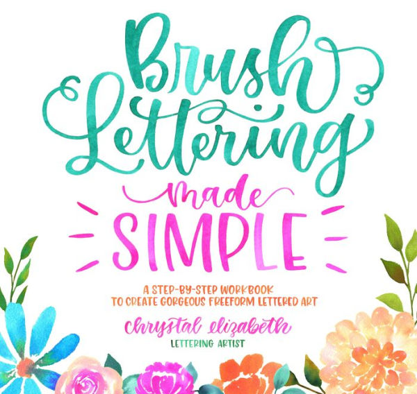
Brush Lettering Made Simple: A Step-by-Step Workbook to Create Gorgeous Freeform Lettered Art
192
Product Details
| ISBN-13: | 9781624146763 |
|---|---|
| Publisher: | Page Street Publishing |
| Publication date: | 11/20/2018 |
| Pages: | 192 |
| Product dimensions: | 9.40(w) x 8.90(h) x 0.80(d) |