

eBook
Available on Compatible NOOK devices, the free NOOK App and in My Digital Library.
Related collections and offers
Overview

Product Details
| ISBN-13: | 9780486141992 |
|---|---|
| Publisher: | Dover Publications |
| Publication date: | 02/09/2012 |
| Series: | Dover Art Instruction |
| Sold by: | Barnes & Noble |
| Format: | eBook |
| Pages: | 112 |
| File size: | 19 MB |
| Note: | This product may take a few minutes to download. |
About the Author
Read an Excerpt
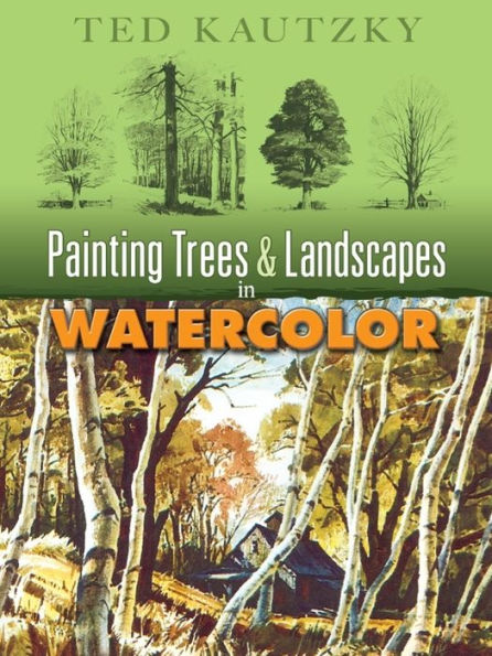
Painting Trees & Landscapes in Watercolor
By Ted Kautzky
Dover Publications, Inc.
Copyright © 2007 Dover Publications, Inc.All rights reserved.
ISBN: 978-0-486-14199-2
CHAPTER 1
MATERIALS
For the best results, watercolor painting requires the use of good materials. This is particularly true of the three basic tools: paper, pigment and brushes. My own preference in paper is always a handmade sheet of rough or semi-rough, all rag stock, in a 300 pound weight. Such a paper, manufactured abroad and known as Whatman, D'-Arches, Crisbrook and Royal Water Color Society, comes in full sheets measuring 22 by 30 inches.
I use a half sheet for most of my outdoor paintings and a full sheet when working in the studio from my pencil drawings and outdoor color studies. Paper of a dubious quality is not only a handicap in the actual appreciation of the color washes, but its chemical impurities will cause deterioration in an otherwise fine performance in color. The economy of these papers I have recommended in a 300 pound weight lies in the fact that both sides are equally well sized and may be used. The D'Arches paper, unlike the others mentioned, is not pure white, being manufactured of bleached rag, but has a real advantage in painting watercolors of fog, rain and mist. For subjects of strong light contrasts, I prefer the whiteness of Whatman or Crisbrook. Of the more than one hundred watercolor pigments available to artists, most successful painters use a palette consisting of about ten to twenty colors. As in the case of paper, the chemical purity and permanence of the pigment are of vital importance. I prefer the transparent watercolor manufactured by Winsor & Newton or Grumbacher. My own palette consists of two reds: Alizarin Crimson and Vermilion Red-the first a cool red, the second, a warm one; four yellows: Cadmium Orange, Cadmium Yellow, Aureolin Yellow and Cadmium Lemon; three blues: French Ultramarine (which I use most frequently for its rich intensity, its ability to mix well with other colors and its characteristic in "settling washes"), Cobalt, especially useful in the painting of summer skies, Winsor and Cerulean Blue, for cool passages of sky and mountains; a green: Hooker's Green Number 2, which I lighten or darken with a mixture of a blue or a yellow. The earth colors, made from the oxides found in the natural soil, provide the watercolorist with warm, brownish tones so useful in painting landscape. I use the two Siennas, raw and burnt, and both raw and burnt Umber.
For the neutralizing of various color washes and mixtures, I employ two grays: Davy's Gray, which has a warm tone, and Payne's Gray, which is cool. Finally, I make occasional use of Sepia -a warm, brownish gray, which I use for monochrome studies.
Again, I advise buying a few good brushes of the best quality. For most of my work I use the flat, square-end sign painters' ox-hair brushes-the half-inch for general use, and the one-inch for the larger washes. You will also need at least two round brushes-a small one, number 2 or 3, for details, and a large one, a number 12, for medium sized washes. If possible, get these in red sable.
In my previous book, Ways with Watercolor, I have gone into much greater detail concerning my materials.
CHAPTER 2COMPOSITION
Perhaps the most important consideration in the painting of successful pictures in any medium is the design or composition. Nature provides the artist with inspiration, motifs, color and arresting forms, but the business of arranging any and all elements into a pleasing design is the vital problem of organization.
When going out to paint a landscape, the first thing to do is to arrange all of your materials and equipment in good order.
Next, do not make the mistake of traveling in circles hoping to find the perfect subject ready-made for you. Make it a practice to stop at the first subject that attracts you and get to work. But this does not mean you should start painting immediately. Walk around the subject and try to select a point of view that lends itself to the best position with full consideration for the light direction and the most attractive deposition of the major masses.
Having selected your position, take time to make one or more preliminary drawings in small scale, placing the accent on the simplest pattern.
Painting a picture is like building a house. First comes the plan, next the construction of the framework, and finally, the refining details of ornamentation, color and textures.
As an aid in making my initial remarks concerning composition clearer, I have prepared the group of examples, opposite. In each of these three sets, I have used the same general subject matter. In the examples on the left, the design indicates a less than satisfactory composition; those on the right of each present a re-arrangement with additional elements, providing better pictures.
Starting at the top, example number 1 shows a monotonous arrangement. The barn and silo are centered, left to right; the flanking trees and mountain background are too evenly spaced.
In number 2, variety of pattern and informal balance have been achieved by the placement of the barn off center to the left; the curvature of the road has been accentuated in the foreground; and a willow has been added in the middle distance. The large tree to the right, reflected in the mud puddle, has also added interest.
Number 3 has considerable line movement but fails to contain itself within the picture plane, as the perspective lines of sky, trees, and distant mountain all lead out of the picture, from the upper left to the lower right. As a counterbalance for this fault, in number 4, I have introduced a clump of dark tree forms on the right bank, and changed the slant of the mountain outline. Notice too, that the trees to the right being barren of foliage, provide a marked contrast to the fullness of the other tree masses.
In example number 5, we find the picture optically overweighted on the left side. Only by cropping it about one-third on the right, could proper balance be effected-which would make an upright shape instead of a horizontal one. By adding the two trees on the right side, and increasing the dark mass of trees in the middle distance farther to the right, number 6 becomes a well-balanced and more interesting composition. The changes that have been discussed and graphically shown here are in effect the kind of preliminary sketches I have recommended in the beginning of this chapter. It is not necessary to make them as complete as I have to serve the important purpose. Pencil may be substituted for the Sepia wash. The significant thing about it is that by making two or more studies prior to plotting the composition on your watercolor paper, much of the trial and error will be eliminated.
A very dramatic effect may be produced by a low eye level, intercepted by tall verticals. This is displayed in example 7, but it has the same monotony as example 1, on page 3. The even spacing of the trees with each one rising to the top produces a static effect that acts as a barrier to the eye. Now examine the picture opposite (number 8). I have eliminated one tree, and in re-spacing the others, opened up a passage for the road. The simple device of placing the white house foiled against the dark of the mountain carries the eye into the background. Also note that the second tree from the left side does not carry to the top and thereby helps to stop the vertical movement, returning the interest to the horizontal plane.
Now we come to four separate pictures that demonstrate particular features which need special explanation.
In painting mountains, and in fact all angular forms, there is a natural tendency to create monotony through the paralleling lines. I have tried to avoid this situation in number 9 of the mountain picture, by supporting the pyramidal snow-capped peak by a series of contrasting obliques. The eye, entering the composition on the flat foreground plane, is carried in a series of zigzag movements to the topmost peak. The larger masses are broken up with textural indications and varied in pattern by contrasting values. Distances are further enhanced by the receding scale of the trees, from those in the foreground to those suggested on the slopes. The giant Sequoias in picture number 10 would not impress us with their great scale were it not for the presence of the pines introduced alongside of them in the middle distance. This device of providing a unit of familiar measure-like a figure or animal-immediately creates the illusion of contrasting scale.
If you select a subject to paint that does not have perspective lines which lead into the picture (such as we find in examples 7 and 12), the illusion of depth may be obtained by varying the spacing of the parallel forms-shadows on the ground, a horizon line, or in the sky area, the cloud forms.
I have put this principle to work in picture number 11. The horizontal spacing diminishes from foreground to horizon on the ground plane, and also in the cloud forms, from the top to the horizon. The depth is further enhanced by the value arrangement which will be taken up in the next chapter.
Picture number 12 presents one of the most powerful devices in composition, wherein all of the perspective lines- of the roadway, trees and telephone lines-lead the eye to a point of convergence at the horizon. In painting this kind of picture, it is important to avoid placing the point where all the perspective lines converge in the dead center. I have avoided this by (1) using a low eye level and (2) by forcing the end of the road off center, to the right.
CHAPTER 3VALUE ARRANGEMENT
Values in watercolor painting often present the artist with more problems than color. In his desire to record local color and atmosphere, the painter sometimes fails to produce the correct value. His darks are often not dark enough and his light values, too dark. This is the reason that it is altogether possible for the experienced artist working with a limited palette to paint a very successful picture, if his values are convincing. We have only to look back in the history of art and to reproductions of some of the early watercolor masters who worked with a few simple colors, but who had a thorough command of values, to realize the truth of this statement.
The six illustrations opposite are all tone variants of the same pictorial composition. From any one of these value studies (and here again I wish to emphasize the importance of the preliminary sketch) one could paint a picture in full color. While these examples are arbitrary value arrangements, each one is possible under proper conditions. Now let's examine each picture and analyze the value scheme, confining our major attention to the three principal tones. In number 1, the foreground of roadway and tree is a medium dark value; the middleground of house and smaller trees is the darkest value; and the mountain in the background is a simple silhouette of light value. Details within each of the principal values- such as cast shadows, textures in roadway, trees and grass-should be regarded as belonging to the overall pattern of each of the three major values. The next example, number 2, presents a contrasting value scheme. Here, the foreground is cast in the lightest value, with the middleground in the medium dark value, and the background mountain in the darkest value.
Next, in number 3, the foreground is the darkest, the middleground is the medium dark and the mountain background is the lightest value. Picture 4 has the same foreground value as number 2, but the values of middleground and background are reversed: the house and smaller trees in the middle distance are the darkest value, with the mountain background the medium dark.
In picture 5, the value arrangement creates a dramatic accent in the middleground by foiling its light value against the background, which is dark. The final illustration (No.6) also gives dominance to the house and trees in the middleground by contrast with the darkest value foreground, and a middle dark background.
In making value studies such as these, the object is to keep the individual detail subordinate to the major tone masses. The student could not be directed to finer examples than the preliminary drawings of Rembrandt and Goya. These masters evolved some of their greatest works from miniature studies in which the great emphasis was placed on value patterns and value contrasts. This virtue may be seen carried out in their prints (in monochrome) as well as in their paintings in full color. I would like to suggest that readers who are anxious to improve their handling of values would benefit by making six similar value studies of one of their own paintings. You will find it an invaluable experience and not a mere exercise.
CHAPTER 4FOG AND RAIN
While the painting of subjects in strong contrasts of sunlight and shadow produce colorful pictures, artists ought not to neglect the opportunity to tackle the atmospheric qualities created by fog and rain.
Fog obscures details, especially in the middle distance and background, creating silhouettes. Local color loses its original identity and takes on the color tone of the fog, as the planes recede into the background. Fog is usually a purple gray, a gray green, or a neutral gray. The foreground color however is less affected, although here too the grayness of the general atmosphere reduces tone values into subtle relationships. Usually the foreground is the darkest value in a picture under conditions of fog or rain. My palette for painting fog and rain is usually composed of French Ultramarine Blue, Burnt Umber, Hooker's Green No. 2 and Davy's Gray.
There are two ways to create this misty effect. In the first one, I wet the paper with sponge or brush in that section of the composition which is affected most by the fog-usually the background. Into this dampened area I paint the forms with my brush loaded with pigment, adding only a little water. Too much water would cause the already saturated paper to spread the color beyond control.
The second way calls for painting the whole picture on dry paper. After the washes have dried thoroughly, I superimpose clean water with a brush to soften and to blur slightly those sections which require the greatest fog effects, working quickly to avoid brush marks. The painting at the top of the opposite page was painted in the following order. The general composition was lightly indicated in pencil outline and the first color wash was concentrated on the dark tree form, in the right foreground. This was kept as dark as I could make it, without losing transparency. Next, the trees in the left foreground were painted similarly. The road was my next consideration, and here again I related the dark foreground to the value of the larger trees, graduating the wash from the immediate foreground to the high-lighted area in the middle distance. The architectural forms were indicated next, and like the roadway, painted from dark to light, as the planes receded into the background.
The misty quality of the fog in the central background was achieved by painting the sky and farthest tree on a wet surface. When this area had dried, I superimposed the next elm in a slightly darker value. Finally, the details of foliage, sky, architecture and textures were added, combining dry - brush strokes with normal washes.
Throughout this picture, I worked from foreground to background, graduating values and sharpness of detail to create the atmospheric effect.
The New England street scene below was painted in the same general order, except that in this picture, I reserved white paper areas of the rooftops to indicate their wetness. To further the illusion of rain, I used reflections of the trees and sky in the immediate foreground. The sky was painted last, concentrating the lightest value (white paper) as the foil for the silhouette of the church steeple.
CHAPTER 5ROAD PUDDLES
Puddles in a roadway, which so often form in the depressions of dirt roads after a rain, or in the Spring with the melting of snow, can be so interesting that they often become the dominant note in a picture. This is illustrated in the top painting on the opposite page. Here we have a simple landscape that, without the light puddle in the foreground, would certainly have lacked a center of interest. With it, the picture becomes alive, the long curves of the meandering road are made more rhythmical by the opposing shape of the pool outlines. The eye passes easily throughout the entire composition returning to rest on the brilliance of the puddle, which, in reflecting the sky overhead, is a light passage.
In painting this watercolor, I first worked in the sky on a wet surface, leaving the passage directly over the mountain tops to the left of center, the white of the paper. Next came the mountain silhouettes in the background, with the farthermost one lightest in value. The middleground, with its dark pattern of trees, farmhouse and field, was indicated, to be followed in order by the embankment of the road and the clump of trees on the right.
(Continues...)
Excerpted from Painting Trees & Landscapes in Watercolor by Ted Kautzky. Copyright © 2007 Dover Publications, Inc.. Excerpted by permission of Dover Publications, Inc..
All rights reserved. No part of this excerpt may be reproduced or reprinted without permission in writing from the publisher.
Excerpts are provided by Dial-A-Book Inc. solely for the personal use of visitors to this web site.
Table of Contents
IntroductionMaterials
Composition
Value Arrangement
Fog and Rain
Road Puddles
On Painting Roads
Useful Strokes for Painting Trees
Painting Trunks and Foliage
The Forest
Ten Varieties of Trees
The Willows: Plate: Willow Road
Evergreens: Plate: Grand Valley, Colorado; Plate: Loch Vale, Colorado
The Maple Tree: Plate: Autumn in Vermont; Plate: Golden Maples
The Birches: Plate: Along the Road in New England; Plate: Birches at Forest's Edge
The Sycamore: Plate: Pennsylvania Farm
The Palms: Plate: St. Philip's Church, Charleston, S.C.
The Elm Tree: Plate: New England Village; Plate: Farmland in Vermont
The Oaks: Plate: The Gnarled Oak; Plate: Spanish Moss
Lombardy Poplar and Aspen: Plate: Aspen Grove, Colorado; Plate: Poplars
Monterey Cypress: Plate: At Carmel Bay, California
Practice Subjects