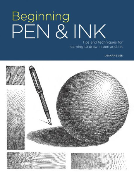
Read an Excerpt
CHAPTER 1
Started
Tools & Materials
One of the many benefits of drawing with pen and ink is that it requires few supplies. You can start with the most basic tools — a pen and a drawing surface — and then add to your artistic arsenal as you discover your own interests and preferences.
Let's begin by exploring your drawing tool options.
PENS
NIB PEN A nib or dip pen consists of two parts: a nib and a handle or holder. Nibs are made of metal and, as their name implies, the ink is replenished by dipping the pen into an inkwell.
FOUNTAIN PEN A fountain pen is similar to a nib pen except that it holds an internal reservoir of ink, thus eliminating the need to dip the pen into an inkwell. Some fountain pens require you to refill the internal reservoir, while others offer prefilled ink cartridges.
TECHNICAL PEN The technical pen is favored by many pen and ink artists, myself included. It consists of an inner ink reservoir and a tubular nib. Some technical pens offer refillable inks and interchangeable nibs, while others are disposable. Originally used for architectural and technical drawings, these pens offer consistent line width and come in various sizes.
BALLPOINT PEN A ballpoint pen dispenses thicker, oil-based ink via a small sphere at its tip. It contains an internal reservoir, which makes it easy to transport and use. It is one of the most popular writing pens out there.
NATURAL MATERIALS Some of the earliest pens were made from materials found in nature. Among those still in use today are the quill pen, made by shaping the molted primary feather of a bird, and the reed or bamboo pen.
ROLLERBALL PEN This pen uses a mechanism similar to the one in a ballpoint pen. However, it contains water-based inks, which create a smoother, even flow and a more consistent line.
FELT-TIP PEN A felt-tip pen has an internal ink reservoir and a nib that's made from a porous material. It comes in a wide variety of colors and sizes.
Brush A pen is not the only way to transfer ink onto paper. A brush can create an endless variety of strokes and allows for techniques that can't be achieved using pens.
INK
There are two basic types of drawing ink: pigment and dye-based. Pigment ink tends to be more durable — it lasts longer, resists fading, and is water-resistant — while dye-based ink is available in a wide range of vibrant colors. There are several things to consider when deciding which ink to use, including:
• Flow: How easily does it flow onto the drawing surface?
• Water-resistance: Will it change when exposed to water?
• Smear-resistance: Is there a danger of smudging?
• Permanence: How long will it last?
• Dry time: How long does it take to dry?
• Finish: What does it look like after it dries?
SURFACES & SUPPORTS
Walk into any art-supply store, and you will find an endless array of drawing surfaces from which to choose. As with ink, your choice depends on your taste and desired effects. For sketching and practicing, any basic printer paper will do, but when working on a final piece, choose a surface with more weight and permanence.
WHEN CHOOSING A DRAWING SURFACE, THERE ARE THREE BASIC ELEMENTS TO CONSIDER:
• Weight: How thick is it?
• Texture: Is it smooth or rough, and how will that affect your marks?
• Permanence: How long will it last without warping or changing color?
COMMON SURFACES
BRISTOL BOARD A thick, strong paperboard with a smooth surface and a working surface on either side, it comes in a variety of thicknesses.
WATERCOLOR PAPER This also comes in various thicknesses, which are measured by weight, including 90, 140, and 300 lbs. The various textures in watercolor paper can lend interesting effects to your finished piece. Hot-pressed watercolor papers have a smoother finish, while cold-pressed types have a rougher texture.
PEN AND INK OR MIXED-MEDIA PAPER Paper that's made specifically for ink and mixed media is typically smooth and available in a wide variety of weights.
VELLUM This semi-transparent paper is very thin and has a relatively mild texture.
OTHER SURFACES Try your hand at drawing on a variety of creative surfaces, including colored papers, acetate film, wood, and paint.
ADDITIONAL SUPPLIES
PENCIL & SHARPENER All of the projects in this book start with a pencil sketch. Feel free to explore using a fine-art pencil, or follow my lead and use a simple mechanical pencil.
ERASER I recommend having at least three different types of erasers. A gum eraser is useful for erasing large areas, but it will shed as you use it. A rubber eraser (the classic pink kind) is useful for erasing straight lines but will damage your paper if used too vigorously. A kneaded eraser can be molded into any shape you like and is the most useful for erasing small, precise areas.
RULER This is a helpful tool whenever you need to draw, cut, or tear in a straight line.
SKETCHBOOK Many artists keep a sketchbook handy to jot down visual ideas, to work out compositions, or as a drawing surface while traveling. Consider the weight and texture of the paper inside, and look for a book that will lie flat while you work.
Setting Yourself Up for Success
Good drawing begins with the proper setup. Here are some things to keep in mind as you get started.
LIGHTING
Pay attention to lighting when choosing your drawing space. Natural light is always best, so consider setting up next to a window. A neutral lamp will also do in a pinch. The key is to stay away from dim lighting or light that is too warm or too cool.
GOOD POSTURE
As you begin to work, be sure to pay attention to how you sit. Hunching over your drawing can cause muscle cramps and/or back pain, so sit up straight with both feet on the floor, and get in the habit of maintaining good posture while you draw. Take breaks to walk away from your drawing and shake out or stretch your hand and arm muscles.
HOW TO HOLD YOUR PEN
Your choice of drawing instrument will largely determine the way you hold your pen. With nib and fountain pens, it's important to avoid turning the pen while you work and to hold it lightly with some distance between your hand and the paper. A technical pen works well with your natural writing grip, but you should keep your wrist and elbow free and loose. The angle at which you hold brush and felt-tip pens relative to the paper will affect their marks. A ballpoint pen's lines will change depending on how much pressure you apply while you draw.
WARM-UP EXERCISES
Your drawing muscles and joints are just like any other muscle or joint in your body: They perform best when they've had the chance to stretch out and warm up.
Take some time to shake your wrists, stretch your fingers, and circle your shoulders and wrists. Pick up your pen and, holding it lightly, use your whole arm to make a continuous circular motion on your paper. Try holding your pen in different ways, and practice making various types of lines. The key is to keep it loose and use your whole arm as you move your pen across the paper.
CHAPTER 2
BASIC
Techniques
Line Work
The first step to using pen and ink is learning how to control and communicate with line. Let's go over a few types of lines to give you some ideas.
STRAIGHT LINES
A straight line may seem fairly static; it goes in only one direction. But flip that line onto a diagonal and give it some friends, and you've got a party!
When using straight lines, keep in mind that horizontal lines communicate rest, peace, relaxation, and stagnation, while vertical lines imply strength, dignity, and power. Diagonal lines imply movement, dynamism, and activity.
CURVED LINES
What if we change that taut, straight line into a loose, curvy one? Curved lines bring an organic touch to a drawing. Shallow, gentle curves communicate comfort, ease, and sensuality. Steep, tight curves may suggest confusion, intense movement, and chaos.
THICK VS. THIN LINES
Another way to change how your line communicates is by adjusting its weight, or its thickness or thinness. Thickening a line makes it seem heavier and more imposing. Thinning a line communicates delicacy and lightness.
By varying the weight of a single line, you can make parts of that line stand out or appear darker in some areas, creating the illusion of three-dimensionality.
ADD VARIETY
You can change the quality of your line by varying its length and repetition. Long, continuous lines feel visually smooth, while short, choppy lines look rougher.
HATCHED LINES
Repeatedly using straight lines in a drawing is called "hatching." Crosshatching means repeatedly layering straight lines in different directions. We'll go into more detail about this when we talk about texture (shown here) and value (shown here).
IMPLIED LINES
You can also form a line without drawing it at all. This is called "implied line" and requires using the negative space in a drawing to make it seem like there is a line. Another way to imply a line is by almost-but-not-quite connecting two separate lines. In both cases, your eye makes sense of the negative space by creating a line where there's nothing.
CONTOUR LINE
A contour line delineates the visual edge of an object. It's very possible that you're already using contour line to draw! Any time you draw the outline of an object, you use contour line.
Take a close look at this drawing. Do you see any of the types of lines we just discussed?
Exercise: Contour Drawing
Let's practice what you've learned so far. As we discussed shown here, contour line uses a line to delineate the edge of an object. For this set of exercises, you're going to use contour line to draw the edges and defining lines of an object.
Choose an object with a relatively simple shape, such as a shoe, a flower, or your hand. First, use a pen to slowly draw the outline of your subject without looking at the sheet of paper.
The goal of this exercise is not to create the perfect drawing, but to really look at your object. Notice all the various lines that define it. Draw every divot, curve, and protrusion. You will probably get lost at some point. Don't look down at your paper, though!
Next, draw the same object, again using contour line, but view your work this time. Look at the object while you draw and check that your drawing is proportionate and on the page.
The point of these exercises is to get you to really look at a three-dimensional object and translate the lines that you see onto paper. Avoid thinking about the object as what it is. Instead, think of each line individually: "This line curves up and to the right" or "This line zigzags back and forth."
How to See Like an Artist
As children, we quickly learn how to categorize the world. It is important for us to know that this thing is OK to eat, while this thing is just for playing. This animal is friendly, and that one is not. We create symbols to aid in categorizing, and it is from this place of symbols that we make our first attempts at drawing. "Mommy" becomes a circle with lines that point outward and two dots for eyes. This, of course, is not what Mommy looks like, but it is the symbol we have made to categorize her and thus what we put on paper.
The brain is programmed to create these emblems, making it difficult to keep the mind from meddling when you try to draw something as you see it.
When you draw an eye, you may end up drawing something that looks like a football with two circles in the middle. While you know that an eye is not shaped like a football, your brain has found it to be a useful shape that your hand reproduces on the page.
The goal, then, is to get into the habit of circumventing this analytical part of the brain and drawing what is actually in front of you. There are many tips and tricks that can help you with this. When I draw from life, I imagine the information going straight from my eyes to my hand with little input from my mind. Some artists recommend drawing an object upside down or from right to left. Drawing without looking at your paper (see here) is another helpful strategy.
Your symbolic mind is powerful. At first, you might have to go back and repeat various exercises to get it to quiet down. However, as you persist, you will find it easier to look at what you are drawing and see it as it appears instead of how your mind thinks it should appear.
Exercise: Gesture Drawing
Another way to develop your artist's eye is to learn how to break down your subject into its most basic shapes. Circles, ovals, and rectangles can represent a person. A circle topped with a cylinder and a crescent becomes a pitcher.
For this exercise, grab a pen and a stationary object to draw. Set a timer for 30 seconds, and block in your subject using quick, confident strokes. Ignore the specific edges and lines, and don't worry about textures or shadows. Right now, you're just trying to get the proportions and position right.
Then move on to a different object, or draw the same object from a different angle. Most objects will give you a different set of shapes if drawn from above or below. Continue this exercise until you feel comfortable drawing quickly and confidently.
Now you can challenge yourself by moving on to moving subjects. Pets, kids, and random strangers at the train station make great subjects for gesture drawings.
MORE ON GESTURE DRAWING
Gesture drawing serves many purposes: It helps you figure out the positions and proportions of your subject matter, lets you capture unique gestures and movements, and assists you in translating the three-dimensional world onto a two-dimensional surface. By using pen for this exercise, you will build trust in your ability to draw with something that you can't erase.
Exercise: Linear Perspective
In this section, we'll cover a couple of basic concepts that will help you in your pursuit toward realistic representation. Linear perspective uses angles and points to determine how objects appear as they recede from the viewer. Let's learn more about this concept through the following exercise, which I recommend doing in pencil, as you can erase as you go. A ruler will also come in handy.
ONE-POINT PERSPECTIVE
One-point perspective uses a single vanishing point to demonstrate depth in a drawing. It is used when one full side of an object faces you (such as drawing a house while looking at the front door). This is particularly handy for representing buildings, interiors, and geometric shapes.
To draw a cube in one-point perspective, the first step is drawing a straight line to represent the horizon. Add a dot for the vanishing point, where lines appear to converge as they move out of sight.
Next, draw a square below the horizon line, to the left of the vanishing point. This is the beginning of a cube. With a ruler, draw lines that connect the square to the vanishing point. This makes it look like the square is rushing toward you.
Draw lines around the cube to find its top and side. Use a ruler to check that the lines are horizontal (parallel to the top of the square) and vertical (parallel to the sides of the square).
Erase the lines between the cube and the horizon line, and you've made a cube.
Now repeat the exercise, but this time, draw a cube above and to the right of your vanishing point.
Then draw a cube that sits on the horizon line.
TWO-POINT PERSPECTIVE
In two-point perspective, there are two vanishing points. This is useful when the edge of an object faces you (like when drawing a building with its corner facing you), and it comes in handy when working on a cityscape or any geometric shape.
To create a cube using two-point perspective, draw a vertical line below the vanishing point to represent the cube's front edge. Then draw lines to connect your first line to the left vanishing point. Add a vertical line that connects the two receding lines.
Repeat on the right side. To form the top of the cube, draw a line connecting the two sides.
Draw a line that connects the top of the vertical line on the right to the vanishing point on the left.
Erase any superfluous lines, and you've made a cube.
Now you can create cubes above and on the horizon line.
PERSPECTIVE PRACTICE
Now practice both one- and two-point perspectives using different shapes. Try triangles, circles, and even block letters. As you practice, think about all the things you draw that can be broken down into basic geometric shapes and how you can use linear perspective to represent these objects more realistically.
(Continues…)
Excerpted from "Portfolio: Beginning Pen & Ink"
by .
Copyright © 2019 Desarae Lee.
Excerpted by permission of The Quarto Group.
All rights reserved. No part of this excerpt may be reproduced or reprinted without permission in writing from the publisher.
Excerpts are provided by Dial-A-Book Inc. solely for the personal use of visitors to this web site.